← Case studies
KUS Investments
The image of a capital management company: no loud colours, but stability, class and trust instead.
- Client
- KUS Investments
- Location
- Kraków
- Scope
- Logo, identity, print, signage
- Character
- Minimalism
01
The challenge
A holding company managing several brands on the Kraków market needed an identity from scratch — a calling card of stability, prestige and a modern approach to business.
02
The solution
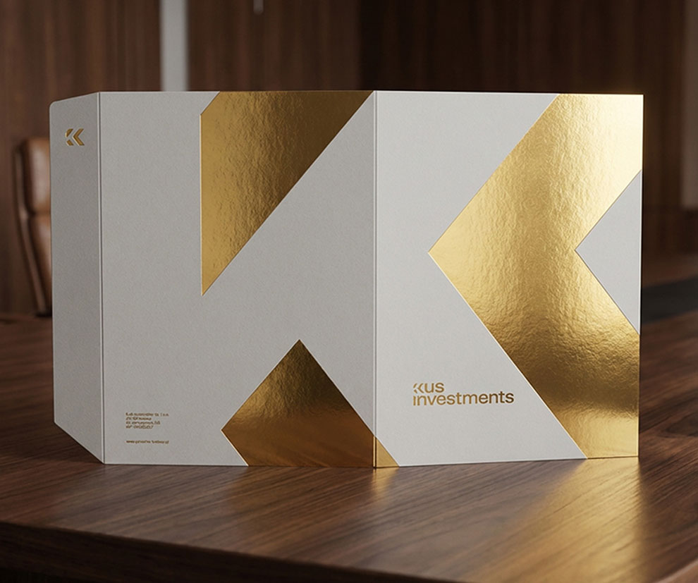
We moved away from complicated symbols towards refined simplicity: a mark of clean lines that stand for structure, order and growth, designed with fine materials in mind.
- Minimalist logo and identity system
- Business cards, letterhead and proposal folders
- Head office signage
03
The result
A complete brand — from the idea to production files. KUS Investments enters the market with an image that earns investors' trust.